
If you’ve ever tried to “one-shot” a landing page with an AI coding tool, you know the failure mode: it looks like every other generic AI/SaaS template on the internet. The spacing is fine, the typography is acceptable, the gradients are trendy—and somehow the result is soulless.
That’s not because the model is incapable. It’s because tasteful design is not just “correctness.” It’s a point of view.
Taste is personal. It’s built from:
- What you’ve seen repeatedly over years
- The patterns you’re drawn to
- The designs that give you that “butterflies” feeling
- The nuances you notice that other people gloss over
A model doesn’t have that lived experience. So if you want it to help you build something with personality, you have to teach it your point of view—or at least provide enough concrete reference material that it can approximate it.
The approach: build taste context before you build pixels
Here’s the workflow I use to build websites and apps with AI in a way that still feels human and intentional.
Step 1: Gather inspiration like an artist (but systematically)
Before I touch code, I collect references—colors, patterns, layouts, retro aesthetics, type treatments—anything that evokes a specific emotion.
Tools like Cosmos (think: AI-powered Pinterest) make this much faster. I’m not looking for “nice design.” I’m looking for specific vibes:
- color hues that feel warm or nostalgic
- shapes/patterns that feel playful or premium
- visual motifs that feel like me
This collection becomes the seed of my taste context.
Step 2: Study the category: competitor analysis with intent
Next, I scroll through the top competitors in the niche—not to copy, but to understand what the “default” looks like and where the bar is.
I pay attention to things like:
- SVG animations and micro-interactions
- layout rhythm and visual hierarchy
- how sections transition
- how typography and graphics are paired
- what feels overused (and therefore easy to avoid)
This is where you learn what most AI-generated sites accidentally converge toward—and what you need to do differently.
Step 3: Create a “taste skill” (your secret weapon)
At some point, I realized the bottleneck wasn’t AI’s capability—it was my ability to repeatedly transfer my taste into the model.
So I built a personal “taste skill” that can:
- review competitor website HTML
- break down the assets and structure
- semi-clone certain elements (layout/animations/typography patterns)
- and, most importantly, compare what it sees against my personal taste corpus
The key idea: I’ve been building a corpus of designs that genuinely give me an emotional response—my “butterflies” set. That corpus becomes a lens.
Instead of asking AI: “make this look good,” I can ask:
- “make this feel like this set of references”
- “reuse this animation style, but with these colors”
- “combine this layout structure with this typography approach”
- “avoid these patterns that feel generic”
This transforms AI from “random design generator” into “style-consistent collaborator.”
Step 4: Write a design doc with AI (context first, then code)
Once you have references and a point of view, you can move fast—but only if everyone (including the AI) is aligned on what you’re building.
Two ways I do this:
- Use Notion MCP to feed relevant company context into Claude (positioning, target audience, constraints, existing brand)
- Or run a structured conversation with co-founders using Notion AI meeting notes to align on product goals and the vibe we want
The output is a short design doc:
- who it’s for
- what it should feel like
- key sections and messaging
- interaction principles
- concrete references
Then we build.
Step 5: Run multiple design iterations in parallel (and recombine)
Instead of iterating linearly, I’ll often run two or three variations at the same time.
For example:
- Version A nails the typography
- Version B has a great hero layout
- Version C has the best animation approach
Then I merge the best pieces. This is where AI tools shine: speed and breadth.
The goal isn’t to pick “the best generated site.” It’s to assemble the best parts into a coherent voice.
The hard part: content and hallucinations
One thing I’ve learned the hard way: if you let AI touch your content too freely, it will:
- hallucinate features
- overwrite carefully-written copy
- invent claims that sound good but aren’t true
So I treat content as its own layer. My process:
- lock down the design and interaction patterns first
- apply strict guardrails for copy (approved claims only)
- refine content later, with human review
When the visuals are strong, you can get away with less text—especially if you use tasteful SVG animations that communicate the vibe without paragraphs of marketing copy.
A real pain point: feedback loops are still broken
Even with great AI tooling, the most frustrating part of building websites is often feedback.
A true story: someone found a layout glitch on an iPhone 12. Getting the information I needed to fix it was absurd:
- they sent a Snapchat screenshot (because they didn’t know how else to share it)
- I had to manually translate that into a prompt
- I had to reproduce it, debug it, and patch it
- the fix itself took ~10 minutes—but the back-and-forth took forever
That’s the real productivity tax: not generating code, but moving high-quality context from users → builders.
The solution (and why I built it): feedback with context, shipped as code
This is also the motivation behind the product I’m building.
Instead of feedback living in scattered Slack messages or vague DMs, the idea is:
- you load an SDK on your website
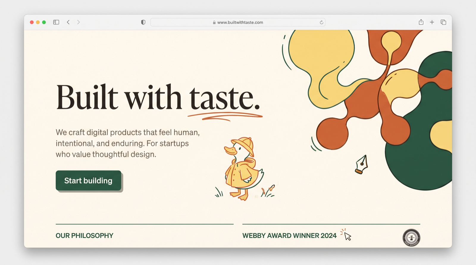
- a user clicks a duck icon (think: Sherlock Holmes + magnifying glass)
- they can draw on the page, leave voice pins, or select a specific element
- and that feedback becomes a high-quality GitHub pull request you can run on localhost, review, and ship
When feedback includes the right context, everything gets faster.
Advice for new builders: solve the context problem
If you want to build your first website or app with “taste” using AI coding tools, here’s the most important thing I’d tell you:
AI doesn’t replace taste. It amplifies it.
Your job is to provide:
- references that resonate with you
- examples of what “good” means to you
- constraints that protect your brand voice
- iteration loops that let you explore without losing coherence
Once you do that, AI becomes a powerful partner: it can generate options, execute quickly, and help you explore—but you remain the editor-in-chief.
Open-sourcing the building blocks: website scraper + taste.md
To make this approach more reproducible, I’m working toward open-sourcing two pieces:
- A website cloning/scraper tool (helpful for breaking down animations/typography patterns)
- taste.md: a personal corpus of markdown notes that captures your design preferences
The dream is that someone new could generate a first taste.md by answering questions like:
- “what designs give you butterflies?”
- “what feels premium vs playful to you?”
- “what colors do you always save?”
- “what do you hate seeing on landing pages?”
Then AI can build with that taste layer in mind.
Closing
The difference between generic AI-generated websites and truly tasteful ones isn’t “better prompts.” It’s better context.
Collect references. Build a taste corpus. Iterate in parallel. Protect your copy. And treat AI as what it is: an incredibly fast collaborator that needs a strong creative director.
That’s you.